How to brand your SharePoint intranet and make it truly yours
Your SharePoint intranet should feel like it belongs to your organization. The good news: SharePoint gives you plenty of ways to make that happen.
Out of the box, you get a clean, functional starting point. With a bit of thought about colors, logos, and layouts, you can transform it into something that feels distinctly yours — a space employees recognize and trust the moment they land on it.
Branding your SharePoint online intranet isn’t about vanity. It’s about recognition, trust, and creating a consistent experience that reinforces your organization’s identity across every page.
What you’ll learn:
- What SharePoint branding involves and where to focus your efforts
- The best practices that make branding effective
- How to avoid common pitfalls
- What Fresh does to make branding even easier
What is SharePoint intranet branding?
SharePoint branding is the process of customizing your intranet’s visual identity to match your organization. Think colors, logos, fonts, layouts — the elements that make a site feel distinctly yours.
Good branding does more than look nice. It builds familiarity. When employees land on the intranet, they should immediately know they’re in the right place. That recognition reduces friction and increases engagement. People use things that feel like they belong to them.
SharePoint modern intranet branding has come a long way. Microsoft now offers built-in theming options that handle the fundamentals without requiring a developer — colors, logos, and site designs that cascade across your environment. It’s a solid foundation to build on.
For communicators, this means you can create a professional, branded experience without needing to involve IT for every change. SharePoint puts the tools in your hands.
Why does SharePoint branding matter?
An unbranded intranet is a missed opportunity. Branding signals that your intranet is maintained, professional, and worth employees’ time.
For communicators, that matters. You’re trying to get people to engage with content, read updates, and actually use the tools available to them. A polished, branded experience builds confidence from the first click.
Effective SharePoint intranet branding delivers real benefits. Employees find what they need faster because the visual hierarchy makes sense. Content feels more credible because it’s presented professionally. And the whole experience reinforces your organization’s identity.
It’s not about winning design awards. It’s about creating something people want to use.
SharePoint branding best practices
Getting branding right in SharePoint requires attention to a few key areas. None of this requires design expertise, just a bit of thought and consistency.
Start with your color palette
SharePoint lets you set theme colors that cascade across your site. Choose colors that work together, remain readable, and align with your brand guidelines. Your primary brand color might look fantastic on a business card, but test how it works on screen — especially for text readability.
Stick to your brand’s official palette where possible, and remember: accessibility matters. Good color contrast (at least 4.5:1 for normal text) ensures everyone can read your content.
Place your logo thoughtfully
Your logo should appear in the header and potentially on key landing pages. SharePoint supports logo placement in site settings — experiment with sizing to find the sweet spot: prominent enough to reinforce brand identity, subtle enough not to crowd the navigation.
If your logo has a complex shape or lots of detail, you may want a simplified version for digital use.
Keep typography consistent
SharePoint’s font options work well for most organizations. The key is consistency: pick a readable font, set sensible sizes for headings and body text, and stick with them everywhere.
Good intranet typography is invisible, it just works. Inconsistent fonts or awkward sizing, on the other hand, make pages feel unfinished.
Design for every page, not just the homepage
Employees spend most of their time on department pages, document libraries, and news articles and not staring at your homepage. Your branding should feel consistent wherever people land. Same colors, same header treatment, same visual language.
SharePoint’s theming helps here by applying your choices across sites. Take advantage of it.
Create page templates for consistency
SharePoint lets you save pages as templates. For content types you create regularly such as news articles, department pages, event announcements, the templates ensure every new page starts with the right branding, layout, and structure.
This is especially valuable when multiple people create content. Templates keep everything consistent without requiring everyone to remember the details.
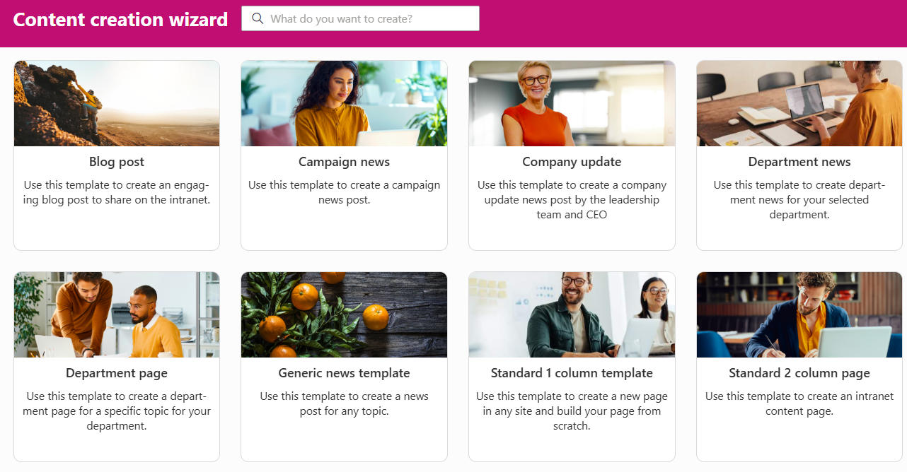
Fresh offers a guided content creation process using page templates and prefilled metadata.
SharePoint branding guidelines to follow
Beyond aesthetics, a few technical considerations help your branding work well everywhere.
Prioritize accessibility
Accessibility isn’t optional, it’s essential. Your intranet needs to work for everyone, including employees with visual impairments, color blindness, or other accessibility needs.
That means sufficient color contrast, alt text for images, and layouts that make sense when read by screen readers. Microsoft’s accessibility checker can help you catch issues early.
Design for mobile from the start
More employees are accessing intranets from phones and tablets. SharePoint’s modern sites are responsive by default, which gives you a great foundation. Test on actual devices to make sure your branding looks good at every screen size.
Many organizations position Viva Connections as the preferred way to access SharePoint content on mobile, using its dedicated mobile experience to deliver a consistent intranet front door.
Consider your global navigation
SharePoint’s hub sites and global navigation let you create consistent wayfinding across your intranet. When combined with your visual branding, this creates a cohesive experience, employees always know where they are and how to get where they’re going.
Plan your navigation structure alongside your visual branding. They work together to create the overall experience.
Work with SharePoint’s strengths
SharePoint online intranet branding works best when you lean into what’s available natively. You can customize colors, add logos, adjust layouts within the available web parts, and modify navigation. These built-in options are designed to work reliably across devices and updates.
Custom development is an option for genuinely unique requirements, but for most organizations, SharePoint’s native theming delivers excellent results with less maintenance.
Getting even more from SharePoint branding with Fresh
Fresh is a SharePoint-native intranet designed for communicators who want polished, consistent branding without the overhead.
With SharePoint alone: You configure theme colors, upload logos, and build pages using the available web parts. It works well, especially with careful planning and consistent application across your sites.
With Fresh: Your brand is applied consistently from day one and managed centrally. Colors, fonts, logos, and layouts work together across every page without requiring you to configure each element separately. Mobile looks as polished as desktop. Updates to your branding propagate everywhere automatically.
Fresh builds on SharePoint’s branding capabilities, making it easier to achieve and maintain a professional, consistent look.
What to keep in mind
SharePoint gives you solid branding options, and they work well for most organizations. A few things to consider:
Some Microsoft interface elements maintain their standard appearance, that’s by design, keeping the experience familiar for users across Microsoft 365. The available fonts work well, though they’re not unlimited. And while custom development can extend what’s possible, it adds maintenance overhead.
For most communicators, SharePoint’s native options (or Fresh’s enhanced approach) deliver exactly what’s needed: a branded, professional intranet that looks like it belongs to your organization.
FAQ
How do I brand my SharePoint site?
Start with SharePoint’s built-in theme settings: colors, logo, and navigation. Apply your brand colors, upload your logo, and customize the homepage layout using available web parts. For more advanced branding, Fresh provides additional options while keeping everything within SharePoint.
What are the best practices for SharePoint branding?
Consistency is everything. Use your official brand colors and logo, but test them for readability and accessibility. Design for mobile as well as desktop. Apply branding across all pages, not just the homepage. And keep it maintainable — simple, consistent choices beat elaborate ones.
What tools can I use to customize my SharePoint site’s branding?
SharePoint’s native theming handles colors and logos well. For more sophisticated branding, tools like SharePoint Framework (SPFx) allow custom development. Solutions like Fresh provide professional branding capabilities without the development overhead, working within SharePoint’s native architecture.
How important is branding in SharePoint for user experience?
Very. Branding affects how employees perceive your intranet before they’ve read a single word. A professional, consistent appearance builds trust and signals that the site is maintained and worth their time.
Make your intranet truly yours
SharePoint gives you the tools to create a branded, professional intranet. The fundamentals – colors, logos, accessibility, consistent layouts, mobile responsiveness, are all achievable with thoughtful planning.
If you want branding that’s polished, consistent, and effortless to maintain, (Fresh might be worth exploring). A SharePoint-native intranet built for communicators, designed to help you get the most from the platform.
Your employees deserve an intranet that feels like home.